• How The Lacerlot Logo Blossomed •
Arriving at the definitive logo for your dream business is complicated - you want it to capture the essence of what you plan to build with your company, and represent something close to your heart. Below is the story of how an outside-of-the-branding-box approach helped me to achieve the perfect logo for Lacerlot.
Lacerlot women are glamorous sorceresses - they may not be dressed in black like a traditional witch, but they exude a covert power that bewitches the eyes of those around them. They are enigmatic and twinkle with an irreverent magic; their Lacerlot dresses cloak them in a gossamer of mystique and wild charm.
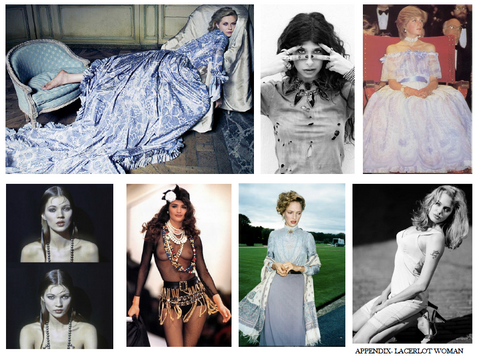
While it was tempting to explore creating a female figure as a logo - especially one that alluded to mystical, fierce women like Calypso, Diana, Athena, or an Amazon (I think that's taken already?) - Lacerlot is not intended to be an altar to just one woman, but rather a celebration of the inherent magic of every individual woman.
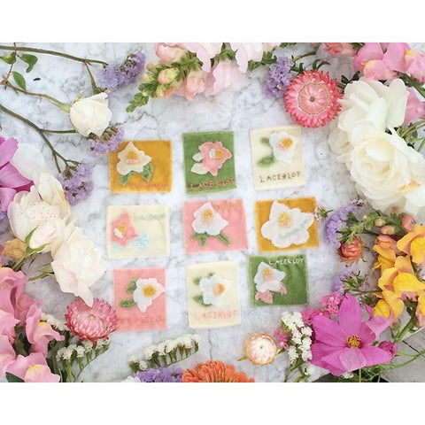
It was also important that the Lacerlot logo could materialize as a detachable pin to adorn a Lacerlot dress, and floral motifs lend themselves easily to that concept.
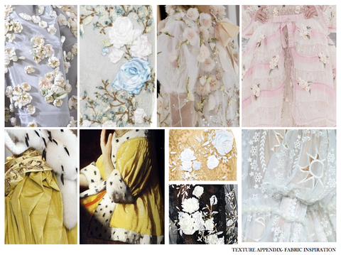
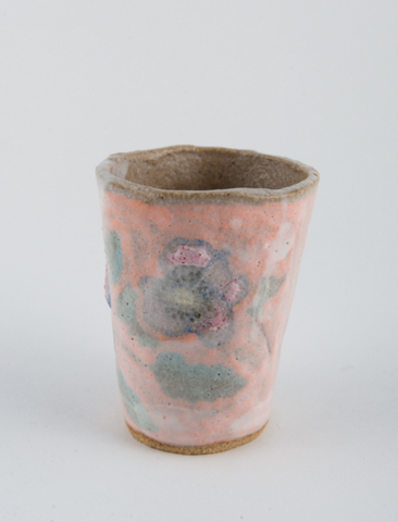
One afternoon while visiting my friend Lynn in Echo Park, LA, I saw a ceramic vase with a thick pink glaze that entranced me. Real beauty commands a visceral reaction, and my eyes wanted to physically consume the imperfect lines of the painted flowers and the poetry of the foggy glaze.
I grew up making ceramics, and knew how difficult it was to intend and then materialize something so beautifully balanced and abstract. When I picked up the piece, it felt complete, as if it had achieved exactly what the artist wanted it to be when she started with her blank pile of clay.
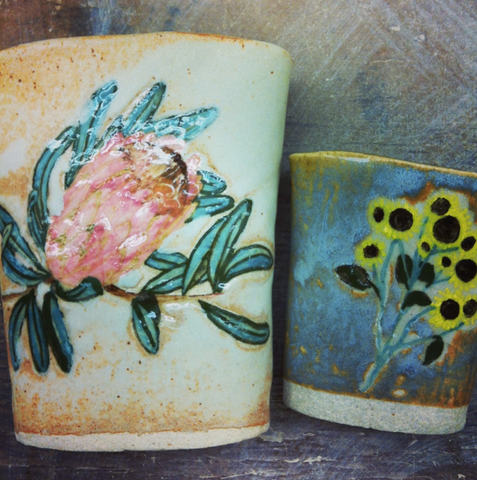
I discovered that the artist was the extremely talented Rebekah Miles, and when I contacted her she graciously agreed to work with me to bring form to the Lacerlot logo.
I highly recommend this approach to other aspiring entrepreneurs. Don't pay a branding agency a fortune to create something generic for you. Find an artist you admire, and reach out directly.
Lacerlot collaborates directly with skilled seamstresses in specialized salons around the world to bring each dress to life, so working one-on-one with an artist to create the Lacerlot logo reflected a fitting parallel.
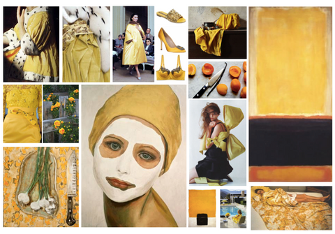
Rebekah and I began by talking about color and texture. I am obsessed with thick paints, especially in lead white and creamy ochre. I sent Rebekah mood boards, and she began painting a series of ideas in various colors and flowers. I deeply appreciated being able to express my ideas to Rebekah, as I knew I could trust her to elegantly interpret them through her paintbrush.

It wasn't until we had reached the magnolia that something really clicked. Magnolia petals have such a satin soft buttery texture. They combine lead white with an epicenter of ochre bud and just a touch of vermillion. Magnolias are ancient flowers that appeared on Earth before bees, so they evolved to be pollinated by beetles. They resonated with me because my elementary school in my small country town had blooming magnolia trees, which I loved sitting under while playing with the fallen petals.
Magnolias also fulfilled another key aspect of my logo checklist: they could be a recurring, unforced motif representing Lacerlot. I imagined them printed on packaging, folded into origami petals atop Lacerlot boxes, in bouquets at the office, made in silk brooches, etc. A logo has to be something that is delightfully ubiquitous throughout your company, and I felt sure that I would never grow tired of their beauty.
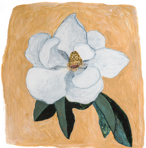
I knew this was the one as soon as Rebekah sent me a draft of the painting. Lacerlot dresses now include hand-stitched velvet magnolias in the labels, and you'll see reincarnations of the Lacerlot magnolia into new mediums soon. I am left with lots of gratitude for Rebekah's incredible sensitivity to color and form, and I hope this story encourages you to approach your creative objectives through alternative paths.
